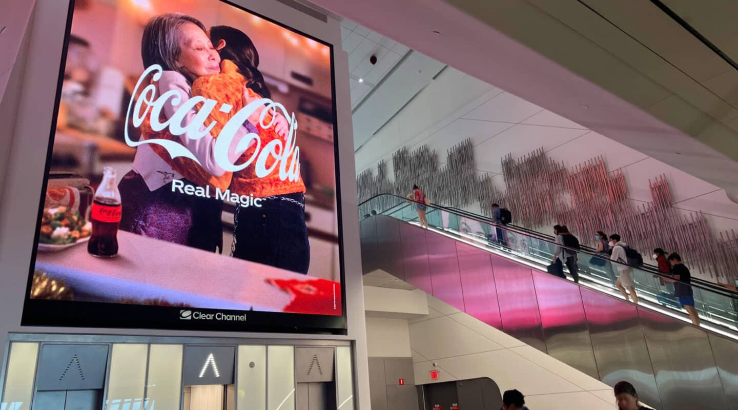
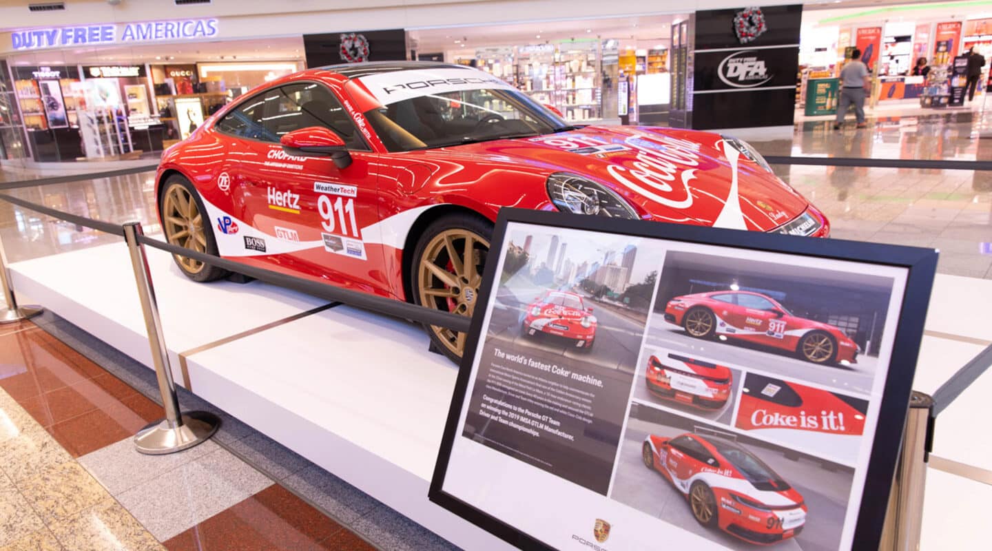
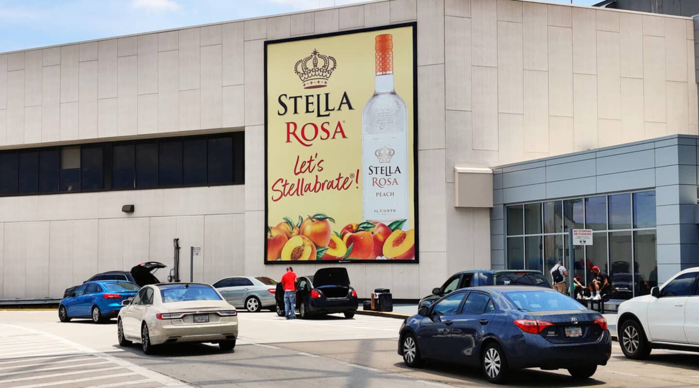
Best practices for airport creative: print, digital, and everything our platforms make possible.
One environment, many attention modes
A traveler walking a concourse and a traveler seated at a gate are two different audiences. Everything in this guide follows one idea: match the message to the moment.
Zone 1
In motion
Walkways. 2–4 seconds. Seven words or fewer.
Zone 2
Slow dwell
Security queues. Minutes of attention. Tell a story in steps.
Zone 3
Seated dwell
Gate holds. The longest dwell in OOH. Detail and interaction welcome.
Zone 4
Arrival
Baggage claim. Decision mode. Keep it short and actionable.
7max words in walkway zones:08–:15typical digital spot length8–10sminimum QR hold on screen2–4 wksprint art-to-posting lead time
The case for better creative
Media buys the audience. Creative decides what happens next.
49%
of sales lift comes from the creative
In a meta-study of nearly 450 campaigns, creative beat targeting, reach and recency by a wide margin.
NCSolutions / Nielsen, Five Keys to Advertising Effectiveness
Up to 89%
of impact when creative is strong
Strong creative drives nearly all in-market success. Weak creative can't be saved by a great media plan.
Nielsen Catalina Solutions
~4x
brand favorability from OOH vs digital
A five-year Kantar study: OOH drove a 13.3% ad-awareness lift and nearly 4x the favorability of digital and CTV.
Kantar x Clear Channel Outdoor, 2019 to 2024
The formats buy the audience. These principles turn it into results.
What's inside
Print best practicesDesigning for backlight, scale and distance.
Digital best practicesSilent-first motion design and loop craft.
CapabilitiesDynamic content, dayparting and sequencing, with real examples.
Print best practices
Print owns its space, design like it
Print holds its position all campaign with 100% share of voice. That rewards bold, simple creative and punishes anything designed for a magazine page.
The principles
Design for backlight, not paper
Backlit colors render brighter and thinner than on your monitor. Deepen rich tones, avoid big pure-white fields, and request a backlit proof for hero work.
Pass the 10% test
Zoom your layout to 10%. If it doesn't read as a thumbnail, it won't read across a concourse. One idea per unit.
Respect live area
Frames eat edges. Keep anything critical out of the outer 10%, with bigger margins on large wraps.
Type earns its size
Favor heavier weights, high contrast, and letter heights readable at the real viewing distance, not the distance in your mockup.
Sequence along the path
Print's superpower is repetition along a walk. Three units on one concourse build an argument; one unit only waves.
Do and don't
Do
Keep to seven words or fewer in walkway zones: brand, idea, done.
Use photography with a single clear focal point that survives cropping.
Check contrast under illumination: dark type on light fields is safest backlit.
Give the logo clear space and the same corner on every unit.
Localize when it's easy; naming the city or route lifts relevance instantly.
Don't
Port a print ad, social asset or web banner to a diorama unchanged.
Set thin or light-weight type at small rendered sizes, especially reversed out.
Put URLs, hashtags or legal copy on in-motion formats.
Bury the brand in the bottom third, where people block sightlines.
Rely on subtle color palettes that wash out under terminal lighting.
Tension fabric at scale: one campaign sequenced across the hall, seven words or fewer per unit.Exterior scale: designed to read from vehicle distance in seconds.
Digital best practices
Design for silence, build for the loop
Motion, flexibility and time-based storytelling, inside real constraints: shared loops, no audio, terminal-specific motion rules. Great creative treats the constraints as the brief.
The principles
Silent-first, always
Type and image carry 100% of the message. If it needs a voiceover to make sense, it isn't an airport spot yet.
Land the brand early and late
Travelers join mid-play. Brand in the first two seconds, hold messages at least three, end on a frame that works as a poster.
Cut for glance, not cinema
Fast cuts read as flicker at distance. Fewer scenes, longer holds, motion that points at the message.
Build to the exact pixel spec
Never letterbox or stretch a 16:9 master. Recompose for each canvas so type sits in its safe area.
Make every frame legible
Strong contrast, generous type, nothing critical in the outer margins. A phone at arm's length is a fair proxy for a screen across a concourse.
Do and don't
Do
Keep your logo on screen for the entire spot; travelers join mid-play and should always know whose ad they're watching.
Hold every message on screen for at least three seconds.
Recompose for each screen's native shape: portrait, ultra-wide, LED wall.
End on a frame that works as a poster on its own.
Deliver a static fallback frame with every spot.
Don't
Save the logo or brand reveal for the final seconds.
Rely on audio; assume every screen is silent.
Use fast cuts or strobing motion; they read as flicker at distance.
Letterbox or stretch one 16:9 master across every canvas.
Cram legal copy or long URLs into a :08 spot.
Learn from work that ran
Examples from our digital networks, each doing one thing especially well.
Simple motion, instant brandMastercard: iconic assets and one gentle move, recognizable from the first frame at any distance.
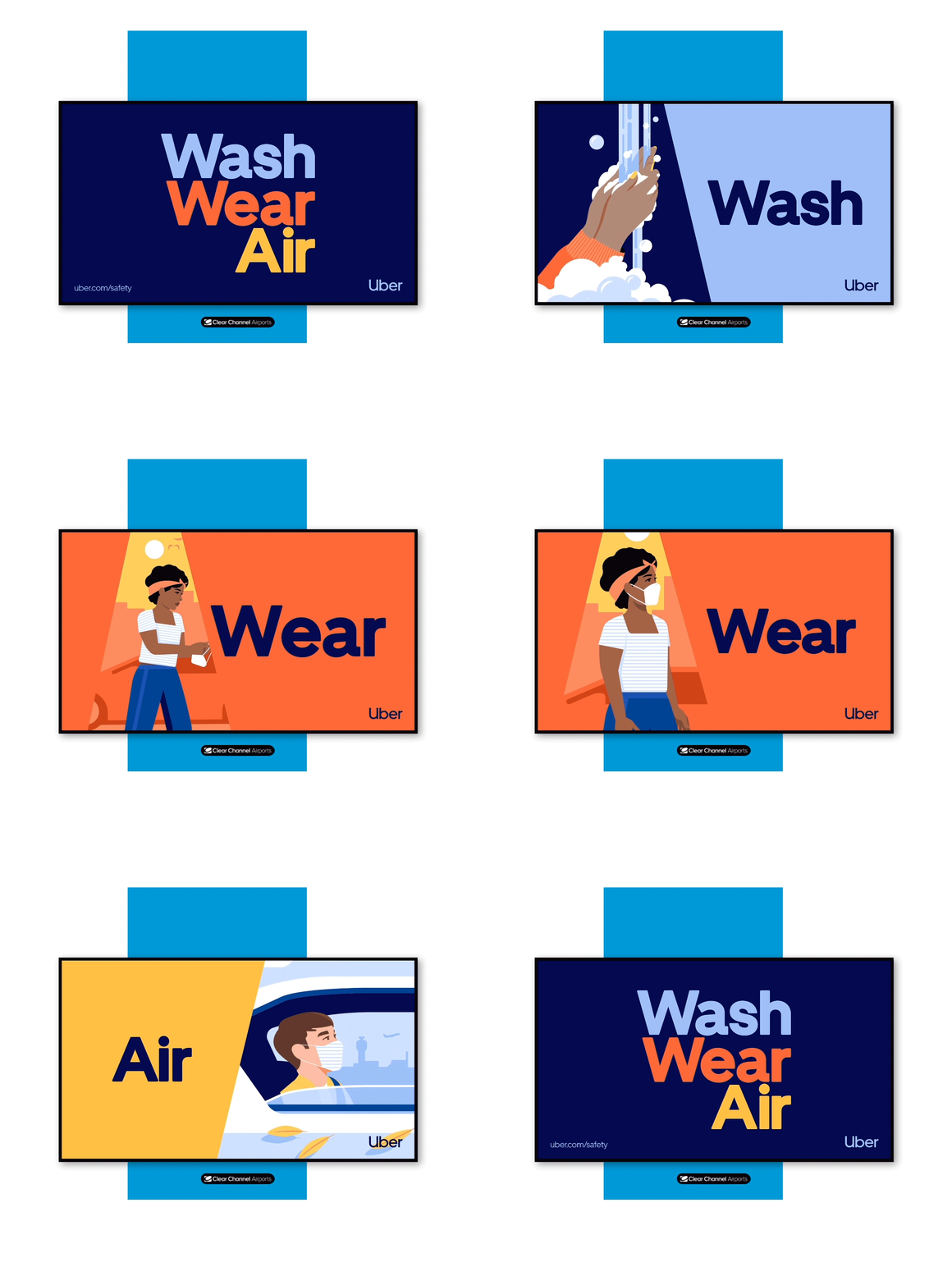
Context-native messagingUber: speaks to the traveler's next need (ground transport) right when it's top of mind.
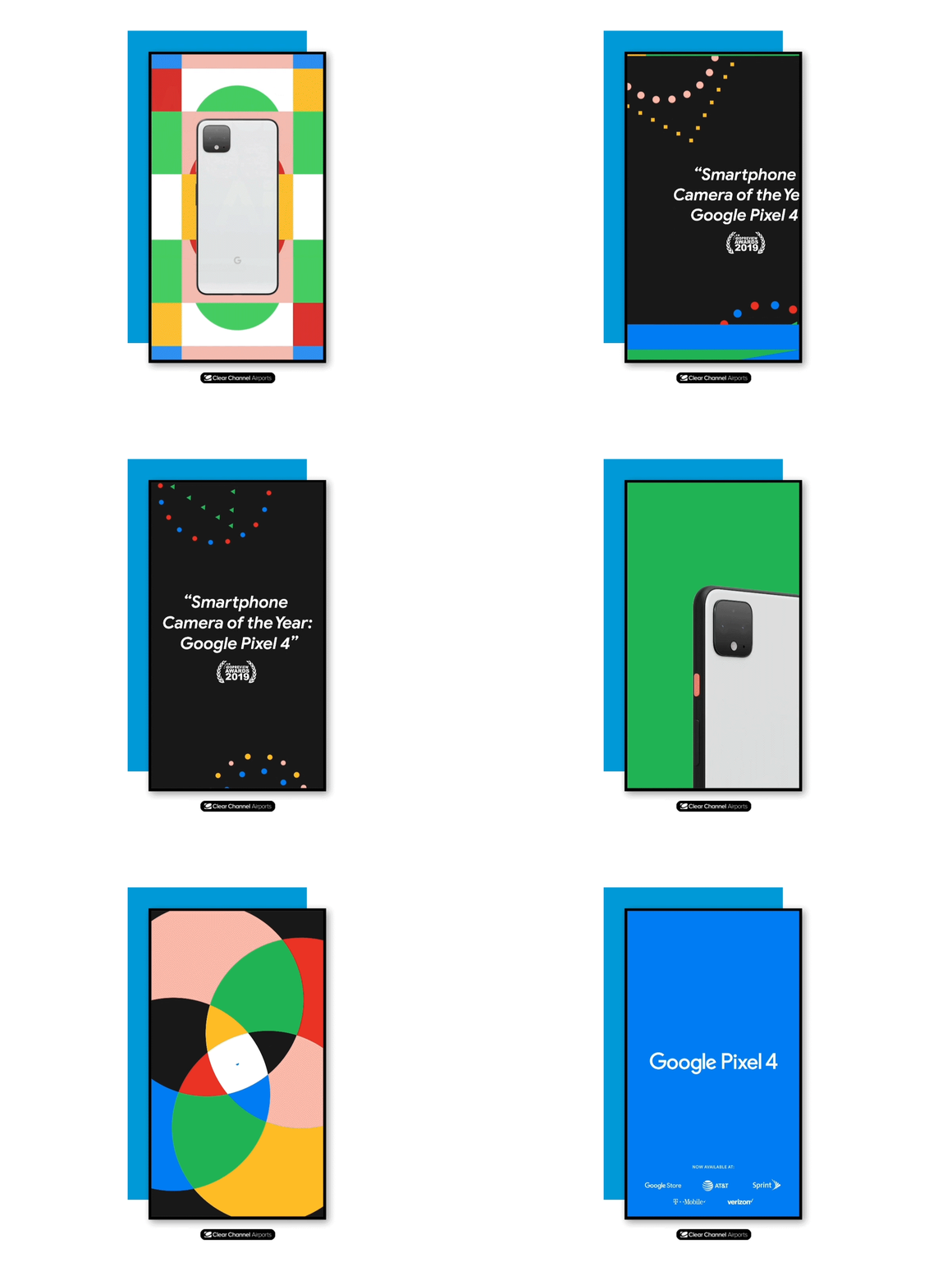
Product as heroGoogle Pixel: large product, minimal copy, motion used only to reveal. Every frame is a complete ad.
Capabilities
What our platforms make possible for creative
From webpage-powered Open Canvas spots to 3D anamorphic spectacles, here's what our platforms make possible, framed for creative teams.
The creative toolkit
Dayparting
Different creative by time of day.
Write for the 6am business bank and the midday leisure crowd separately.
Dynamic data feeds
Live content: weather, countdowns, prices, scores.
Design templates with variable fields, not fixed layouts.
Location versioning
Creative varies by airport, terminal or concourse.
Localized lines ("Hello, Philadelphia") from one master template.
Language switching
Alternate-language versions by gate or market.
Leave 30 to 40% extra room for translated copy.
Full-motion video
:08 to :15 spots where policy permits.
Silent storytelling. Brand early, end on a poster frame.
Synchronized takeovers
Multiple screens play in concert.
One composition across canvases; the terminal becomes the stage.
Rapid creative swaps
New creative live in days, not weeks.
Plan launch-day, mid-flight and reactive versions upfront.
Branded environments
Physical builds, wraps and multimedia spaces.
Think spatially: sightlines, touchpoints and photo moments.
Availability varies by airport and network. Your account team can confirm what's live in each market and share network templates.
Open Canvas: your spot can be a webpage
A spot doesn't have to be a finished video file. It can be live HTML, playing in the loop like any other ad. Anything a webpage can do, your creative can do.
1 · You build a webpageAny feed, any logic, any motion
ZIP
2 · We load it on our playerQA’d on real terminal hardware
3 · It plays in the loopA normal slot, except yours is alive
Build it like a webpage. Ship it like a file. It runs live on our screens.
Open Canvas is client-produced: you own the build and data licensing; we advise on specs and QA. Ask for the package template before your developers start.
Try it: one creative, many moments
This demo is built the way an Open Canvas spot is: it's just a webpage. Flip the inputs and watch one creative adapt itself.
24:00
CIRRUS COFFEE
SAMPLE CREATIVE, FICTIONAL BRAND, RENDERED LIVE IN YOUR BROWSER
Offer feed demonstrates promotions and pricing feeds
Boarding countdown demonstrates live data, ticking on its own
Six inputs, one template. In production the inputs are real feeds: clock, flight data, weather, promotions. Nobody re-exports a video.
Spotlight: 3D anamorphic
Forced-perspective 3D on large LED canvases makes objects appear to leap off the screen. Airports offer what it needs most: big canvases and audiences with time to watch.
Design for the sweet spotThe illusion works from one viewing position. Build the perspective for where travelers actually stand; from elsewhere it should still look intentional.
Break the frame with purposeThe magic is when something crosses the screen edge. Choreograph one clear breakout, not constant motion.
Give it a story arcAnamorphic earns longer watch time. Use a beginning, a payoff, and a branded end worth photographing.
Plan for the second audienceMuch of the value is the social video it generates. Design a moment people want to film and keep the brand in every frame.
The frame-break: the flipper crossing the screen edge is the moment travelers stop for.Curved canvas: the screen geometry itself sells the depth.Dimensional objects at scale, composed for the sightline from the gate floor.The recessed box is the illusion: products appear to float in front of the screen.
Anamorphic needs specific screen geometry and 3D expertise. Talk to us early about eligible canvases and production partners.
Capabilities in action
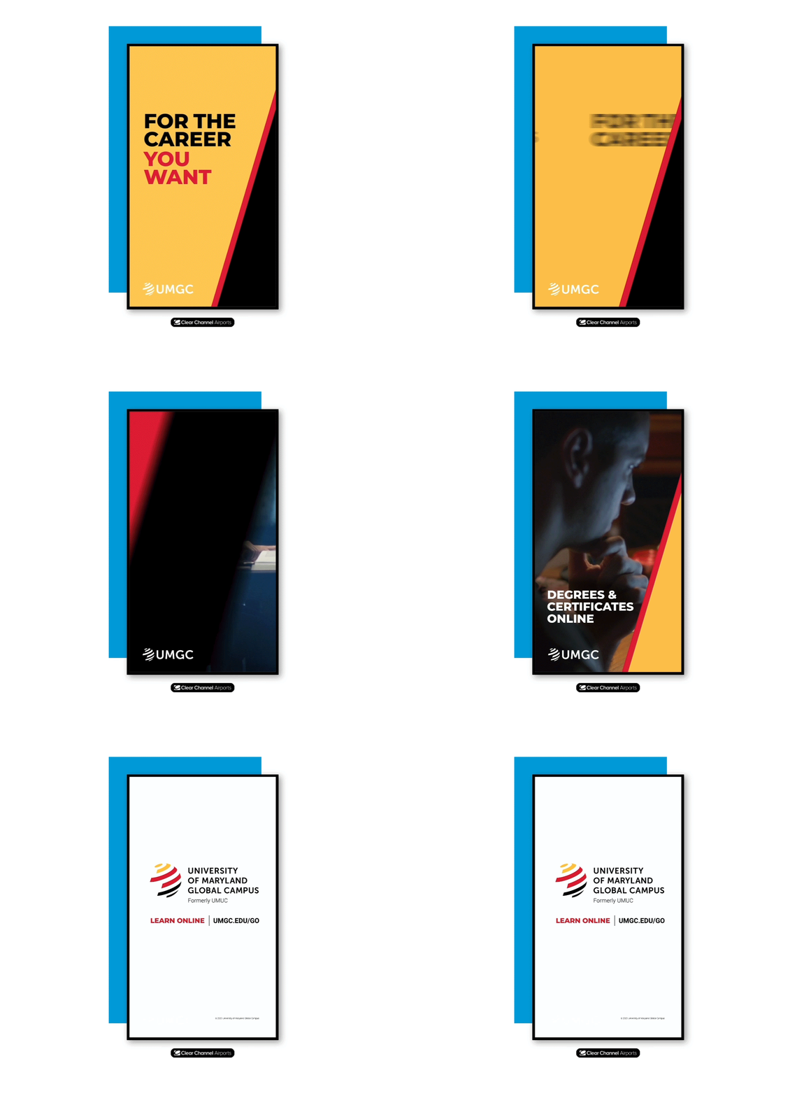
Message sequencingUMGC: a rotating series that builds an argument across the loop rather than repeating one frame.
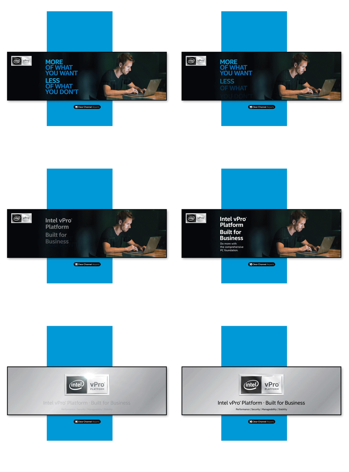
Motion with disciplineIntel: animation used to direct the eye to one message at a time, never competing with itself.
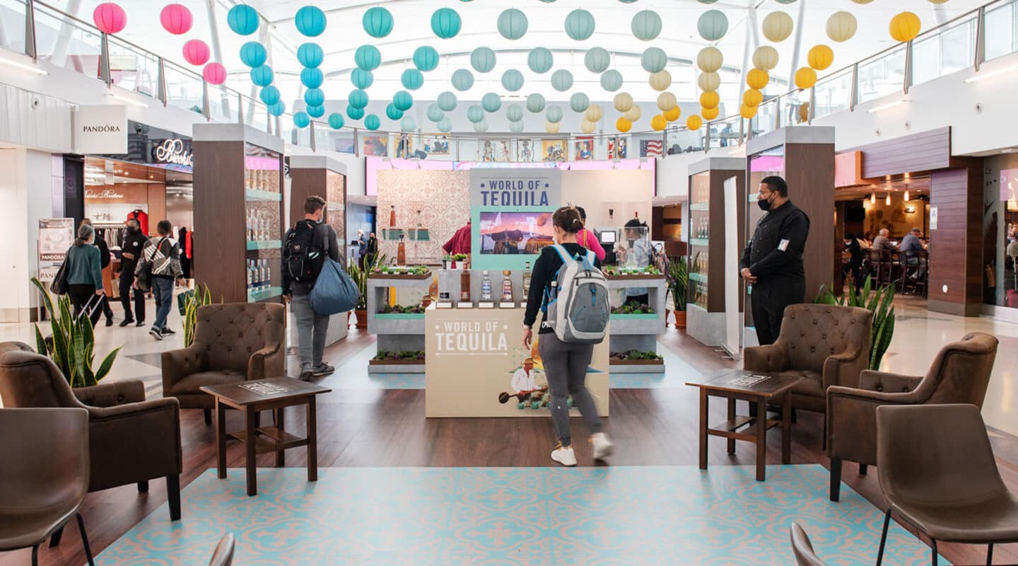
Beyond the screenBranded environments and activations: creative that travelers walk through, touch and photograph.
QR codes & interactivity
The airport is where QR codes actually get scanned
Seated travelers with phones in hand are the best QR audience in OOH. Most executions fail on basics: size, placement, and a reason to scan.
The rules of a scannable code
Put codes only in dwell zones
Gate holds, dining, charging stations, baggage claim. On a walkway format a code is decoration; no one in motion scans.
Size for the real scan distance
Code width ≥ scan distance ÷ 10. Ten feet away means at least a foot wide. When in doubt, bigger.
Give the scan a reason
"Scan for more info" is not a reason. An offer, a download, a game, a boarding-wait playlist, a skip-the-line perk. Name the payoff next to the code in five words or fewer.
Hold it on screen
Keep the code visible at least 8–10 seconds, ideally the full spot. A last-second code punishes the people trying to engage.
Design for contrast and quiet
Dark code, light background, generous quiet zone. Test branded codes on real phones at real distance.
Build the landing for the moment
Mobile-fast, no app wall, works on airport Wi-Fi. Tag each code by placement and scans become your cleanest location data.
QR size calculator
Set the farthest realistic viewing distance for your placement and get the minimum printed or rendered code width.
12 inminimum code width
Rule of thumb: code width equals viewing distance divided by 10. Round up, never down.
Do and don't
Do
Pair every code with a short, concrete payoff line ("Scan for 20% off your ride").
Place codes at seated eye level in gate and dining zones.
Use one unique code per airport and placement for clean attribution.
Test the full journey (scan, load, act) on cellular and airport Wi-Fi.
Don't
Put QR codes on walkway, roadway or exterior formats.
Shrink the code to fit the layout; resize the layout to fit the code.
Send scanners to your homepage; land them on a page built for the offer.
Flash the code briefly at the end of a digital spot.
Specs & production
Great creative, delivered right
Production is where strong campaigns are protected or quietly ruined. This checklist covers the file, timing and approval realities of producing for a secure airport environment.
Planning references
PRINT PRODUCTION GUIDEConfirm exact specs per airport and unit
Item
Guidance
Working scale
Build at 25–100% of final size; 100–150 dpi effective resolution at full size
Logos & type
Vector artwork always; convert or embed fonts on final files
Color
CMYK for print output; request a backlit proof for illuminated units
Live area
Keep critical content clear of the outer 10%; follow unit templates for exact frame allowances
Lead time
Plan 2–4 weeks from final art to live posting; longer for wraps and spectaculars
DIGITAL PRODUCTION GUIDEConfirm exact specs per network
Item
Guidance
Resolution
Native pixel dimensions per screen; never scale or letterbox a generic master
Spot length
:08–:15 typical; build to the exact duration of your network's loop slot
Audio
None. All creative must communicate silently
Motion
Follow per-terminal motion policy; provide a static fallback frame with every spot
Lead time
Days once approved, but airport authority review adds time. Submit early
Airport advertising is subject to airport authority review. Content standards vary by market, so flag anything edgy with your account team before production.
The pre-flight checklist
Work through it before every handoff. Boxes reset when you leave, so print this section for your binder.